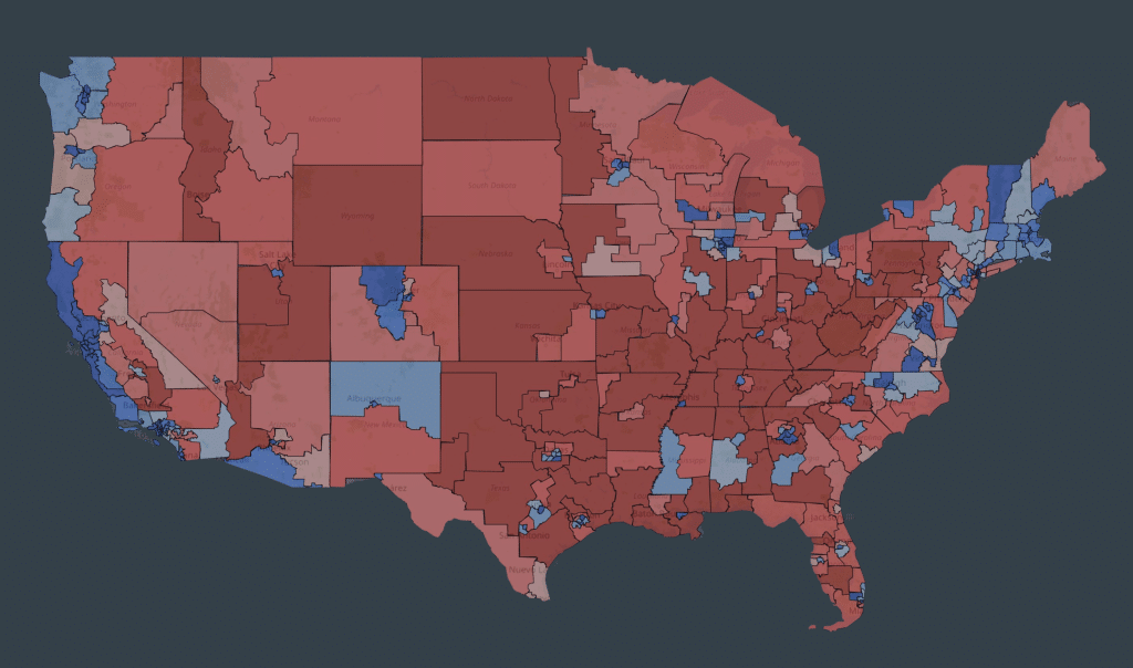
What Congress would look like without gerrymandering
A 435-district map drawn without partisan favoritism shows what fair districts would look like nationwide — more representative, more competitive, and close to guaranteeing that whichever party wins the popular vote wins the House.
Last year, Donald Trump started a race to the bottom in redistricting that Republicans are currently winning. Coming out of 2024, it looked like the maps for the 2026 election would lead to the winner of the House popular vote gaining control of the chamber. But Trump’s mid-decade redistricting push, coupled with the Supreme Court giving the South the green light to eliminate Black representation via the Callais decision, means that Democrats will need to win the House popular vote by about 4 points in 2026 to flip control of the chamber. That seems to be at the lower range of outcomes as long as gas is nearly $5 a gallon, so the mad dash to disenfranchise Democratic voters might end up being for naught.
That’s especially true as Democrats will have the chance to eliminate Republican-held seats in New York, New Jersey, Pennsylvania, Maryland, Virginia, Minnesota, Wisconsin, Illinois, Oregon and Washington if they are successful downballot in those states over the coming year. Analyst Stephen Wolf found in The Downballot that an aggressive push in those states could actually make the 2028 map more favorable to Democrats than the 2024 national map, except there will be a vanishingly small number of competitive seats, and both parties will have to constantly be on guard for changes in political fortune leading to a new round of gerrymandering.
This is not how it’s supposed to work. As I noted in my newsletter, this is how Nazi philosopher Carl Schmitt envisioned politics, not American thinkers like Thomas Jefferson whose ideas previously inspired candidates from both parties.
Which is why I really think it’s in everyone’s interest to implement a ban on partisan gerrymandering nationwide. Congressional Republicans seem to have little interest in pursuing it, but Democrats could either demand it as a condition of passing the budget if they retake control of a chamber in the 2026 elections or try to cut a deal with Republicans where they agree to some form of voter ID in exchange for it.
All of this begs the question: What would fair maps look like? Would a ban on partisan gerrymandering inure to the benefit of Democrats (as most Republicans assume) or Republicans (as Democrats who want more aggressive reforms argue)? What I argue here is that it could actually return a fair, representative set of districts. That’s why I showed what 435 districts drawn without partisan gerrymandering would look like.
A gerrymander-free congressional map
The interactive map below shows what congressional districts could look like if nonpartisan criteria, not gerrymandering, drove redistricting efforts.
States that didn’t have an existing fair map to use were drawn with no public input, so I’m sure there are plenty of beefs with some specific decisions, but this 435-district map is still an improvement over the status quo.
- Note: it’s easier to use the map on laptops or desktops
- In the left column, click on a state to see what the partisan makeup of its delegation would look like, approximately
- In the top bar of the map, click 2024 and 2020 to toggle between those results by district
- Also in the top bar, enter your own address to see which district you’d end up in
- Click “Reset” at the top of the left-side column to recenter the full continental U.S. map
I used the most generous interpretation of the Voting Rights Act (VRA) I could considering the Supreme Court’s right-wing donor captivity. That’s to say my interpretation is that it no longer compels the creation of new districts where minority voters are a majority, but someone can’t intentionally dismantle existing districts that were constructed to do so as long as they are geographically coherent.
While Iowa and West Virginia had political processes for drawing maps, they were constrained by their own requirements to keep counties whole, and the enacted districts are relatively indicative of their states’ politics. So we kept them as well.
For the rest of the country, I took a crack at drawing fair districts ourselves. In addition to the (now weak) VRA criteria, I tried to do our best to minimize political splits for counties and cities as long as those county/city lines seem relevant. This also meant I tried to keep districts within Census-designated metro areas when possible in order to ensure that those communities of interest were kept together and rural areas got their own voices in Congress. I also tried to make lines look “clean;” that is, having fewer jagged edges and being compact.
To comply with equal population requirements all districts that I drew myself are within 10 people of exact equality, except for in Maine in New Hampshire where the tradition of keeping towns whole is strong enough that the variations are a little higher.
Dallas/Fort Worth
With the U.S. map above, you can zoom in to see how your area would look with fair maps. As an example, let’s look at how the Dallas-Fort Worth Metroplex would change. Use the slider in the following image to compare DFW’s current map to a fair map of the same area.
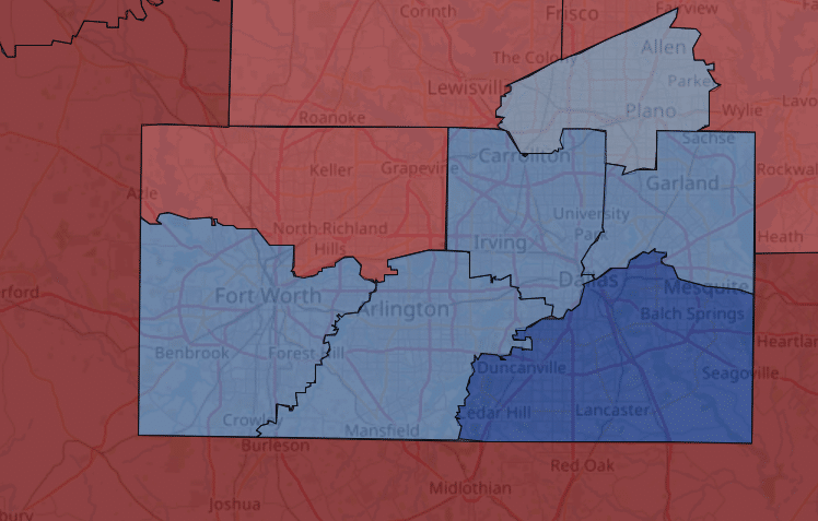
Texas’s current congressional map carves up Dallas and Tarrant Counties such that only three districts are contained entirely within them, instead of the six here. None of the districts under current lines were within 16% in the 2024 presidential election. This map contains six districts (the ones based in Plano, Irving, Garland, Arlington, Fort Worth and Denton County) that were within 16%, and the Plano-based seat was a narrow 3.4% win for Harris. Moreover, it creates actual communities of interest instead of snakes through the DFW area.
So those districts above look better than the status quo, but are they fair? The best way to measure how politically representative a set of districts is with a tool called the mean-median difference. It helps see how the presidential election went in every district and look to see how the 218th seat in order — the median seat, the seat that a party would have to win to get control of the chamber — matches up to the nationwide presidential result. The closer the mean is to the median the more likely Congress represents the political views of the country as a whole.
Orlando, Florida
As luck would have it, under these maps, Florida’s 7th Congressional District in the Orlando suburbs is the median seat in both 2020 and 2024, having gone by 4.5% for Biden and 1.5% for Trump, exactly the final national margin of both elections.
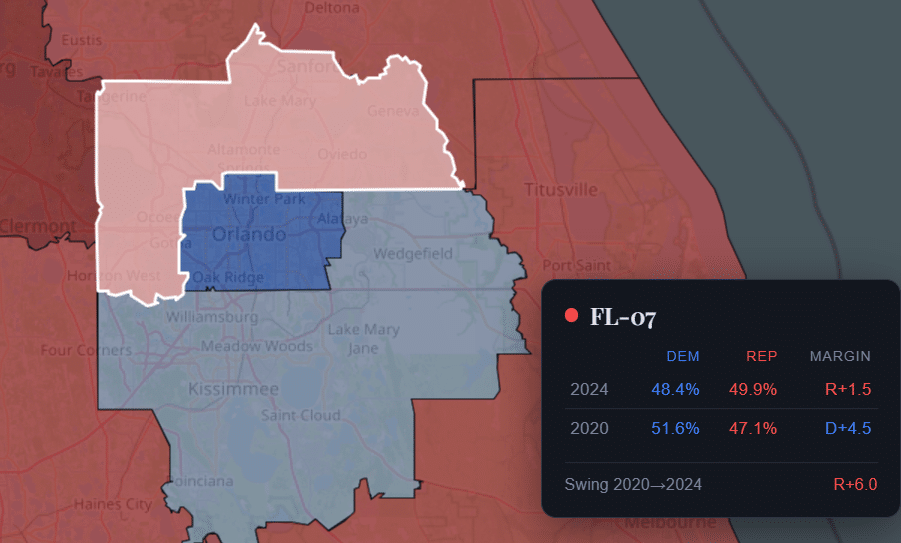
In other words, this set of maps comes very close to assuring that whichever party wins a majority of the vote will carry the majority of seats. In 2024, Trump would have carried 224 seats, while in 2020, Biden would have carried 237, reflecting the relative size of their wins. While this map is a couple points less favorable for Republicans than the existing set of maps nationwide, it also increases the playing field. This map would make it so about 20 more seats were within 10% in both 2020 and 2024.
When I asked Kyle Kondik of Sabato’s Crystal Ball for what he thought about this set of seats, he said, “This exercise shows that applying fairer criteria can increase the number of truly competitive districts, which would make the House more responsive to swings in public opinion and give more voters an opportunity to participate in close elections.”
Moreover, taking partisan gerrymandering away from state legislatures in general seems like a huge win. It means those state lawmakers can’t explicitly target incumbent congressmen. It means those state lawmakers will suddenly find themselves on the receiving end of a lot fewer million-dollar ad buys. It means politicians can spend their political capital on governing, not infighting. It’s gotta be exhausting trying to redraw districts every few years.
Any ban on partisan gerrymandering would have to be Roberts Court-proofed, but a good starting point would be creating some sort of mechanism that forces states to redraw lines when the national mean-median gap gets too far out of whack. The Constitution gives Congress plenary power over the time, place and manner of its own elections, and 2023’s Moore v. Harper showed that there are even limits to this court’s embrace of Calvinball.
Finally, I think this map is kind of pretty. It’s not perfect, but it’s still a pretty decent stand-in for what 435 separate American political communities would look like. If you stare at it, you start to get a sense of what the country is. That isn’t the case with today’s maps, but maybe it could be in the future. And isn’t that something worth working toward?
AI Disclaimer: I drew all of the districts myself in Dave’s Redistricting App and put together the electoral data related to them. I used Claude to pull together the 50 individual state maps into one file and display them with the associated electoral data.
Heartland Signal encourages news organizations and content creators to use our content. You're welcome to republish this article for free as long as you follow our republishing guidelines.
Related Articles

During bid for governor, Ramaswamy has spent nearly 40% of his time outside of Ohio
According to a new report, the multibillionaire has spent 79 days away from Ohio this year — including 14 international travel legs — as he faces off against Democrat Amy Acton.

Michigan Republican films campaign ad in hazardous wildfire smoke
Michigan House candidate Laura Perry is facing scrutiny after filming a campaign ad on a soccer field during a hazardous statewide air quality alert. State health officials had recommended avoiding strenuous outdoor activities as air quality readings exceeded dangerous levels.
[UPDATED] Wisconsin Dems react as Sarah Rodriguez ends bid for governor after campaign finance scandal
Rodriguez suspended her gubernatorial campaign Friday, citing serious financial mismanagement that left her campaign unable to pay for a scheduled $1 million ad buy.
